COLOR + MATERIALS DESIGN & TREND FORECASTING
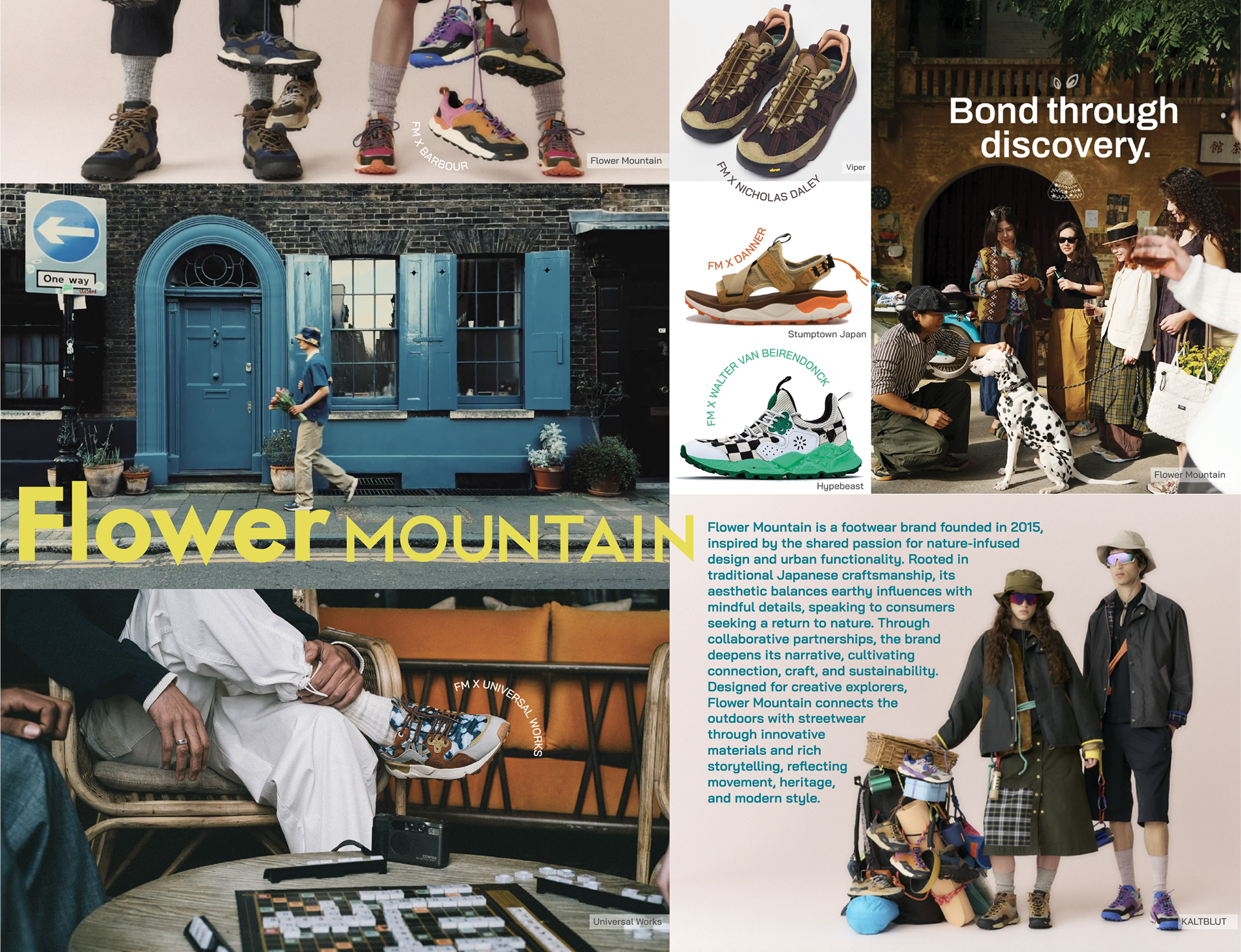
I researched the brand Flower Mountain, analyzing their ethos and identifying cultural and consumer influences. Through this lens, I created a seasonal color story for their women’s lifestyle line and colorway for the Tiger Hill silhouette, as an elevated concept, according to forecasted trends.
This exploratory analysis was part of my final project for a Footwear Color, Materials, Finishes Design & Trend course at Lasell University.
GROUNDED PLAY
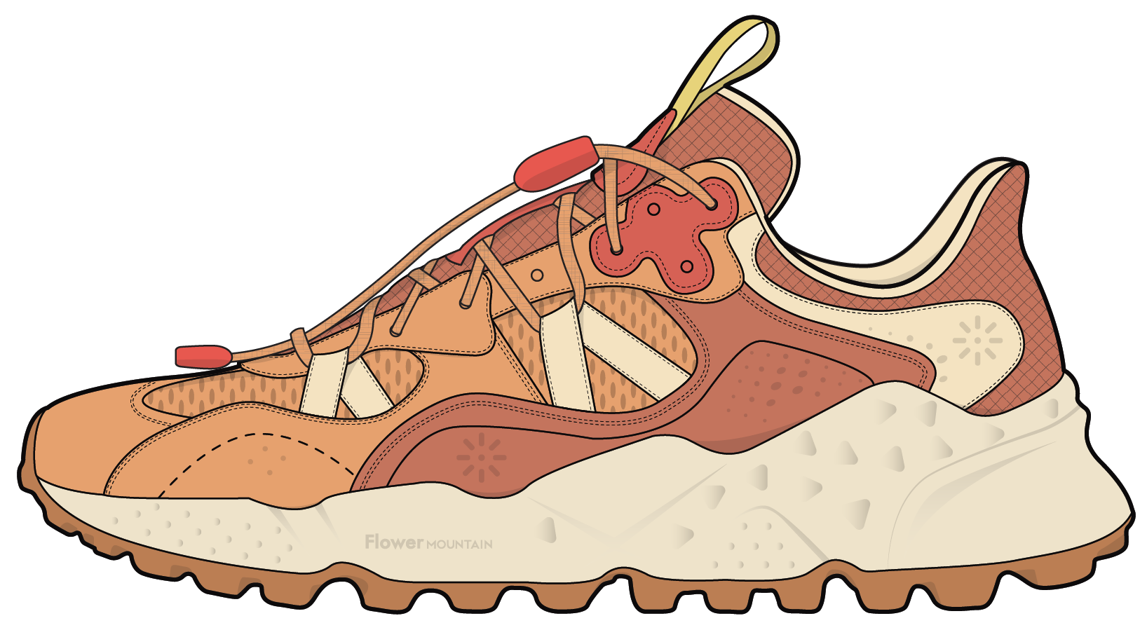
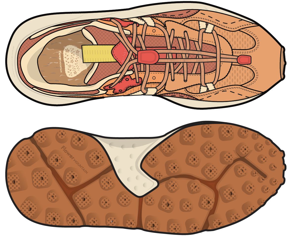
Starting off with my final palette and materials. I created CADs of the Tiger Hill silhouette, applying colors and material details.
Reflecting the brand’s ethos connecting nature, movement, and emotional storytelling, the Grounded Play palette evokes tactile warmth and playful memory through sun drenched hues and upcycled materials, reflecting consumer’s desire for grounding and joy. This color story blends reconnection to the outdoors with emotional restoration and optimism.
I wanted to create a tonal look to bring warmth to everyday life, using primary colors Terra, Mesa, and Sunfade. I added energetic accents of Petal Pop and Dandelion, highlighting the details and craft, while bringing a playful emotional charge to the silhouette.
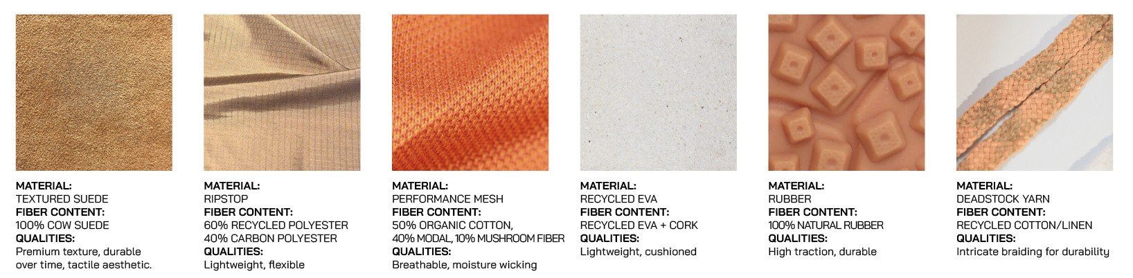
The materials support Flower Mountain’s care for nature by blending expressive design with sustainable practices. Textured suede and ripstop offer durability and craft, while the performance mesh introduces breathability and new fiber technology.Recycled EVA with cork and natural rubber provides lightweight cushioning and trail-ready traction while reducing waste.
BLOSSOM HILL
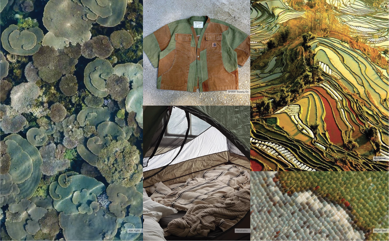
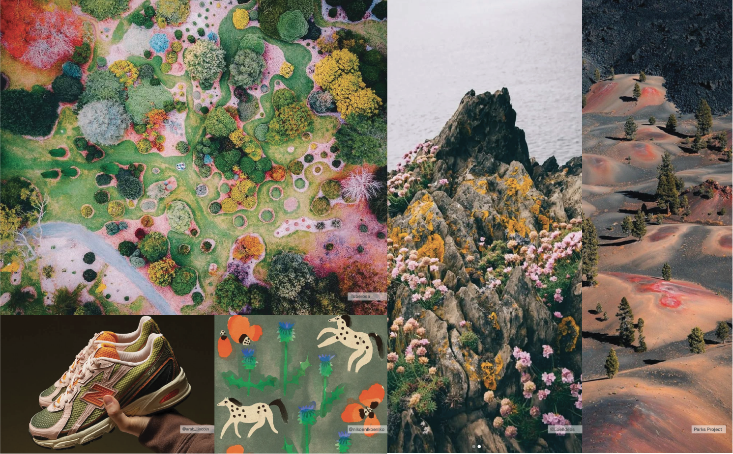
This process began with layered research behind Flower Mountain’s material and color design.
I identified core influences and created a board showcasing their product and overall vibe.
TACTILE BOUQUET
Then I created mood boards to visualize materials and color trends.
MATERIALS: The imagery embodies the brand’s commitment to craft through tactile layers and organic shapes. The contrast of performance textiles and earthy textures reflect traditional storytelling and innovative versatility. As consumers seek grounding and connection with the outdoors, this haptic approach offers reprieve to the digital world. Each element speaks to mindful design and craftmanship, inspired by nature.
COLOR: These images capture Flower Mountain’s embrace of nature through a palette grounded in diversity. The blend of calm, earthy tones with vibrant floral pops reflects a balance between serenity and energy. Consumers crave emotional grounding in uncertain times, and these colors channel reconnection with the natural world, and optimism that invites outdoor adventure.
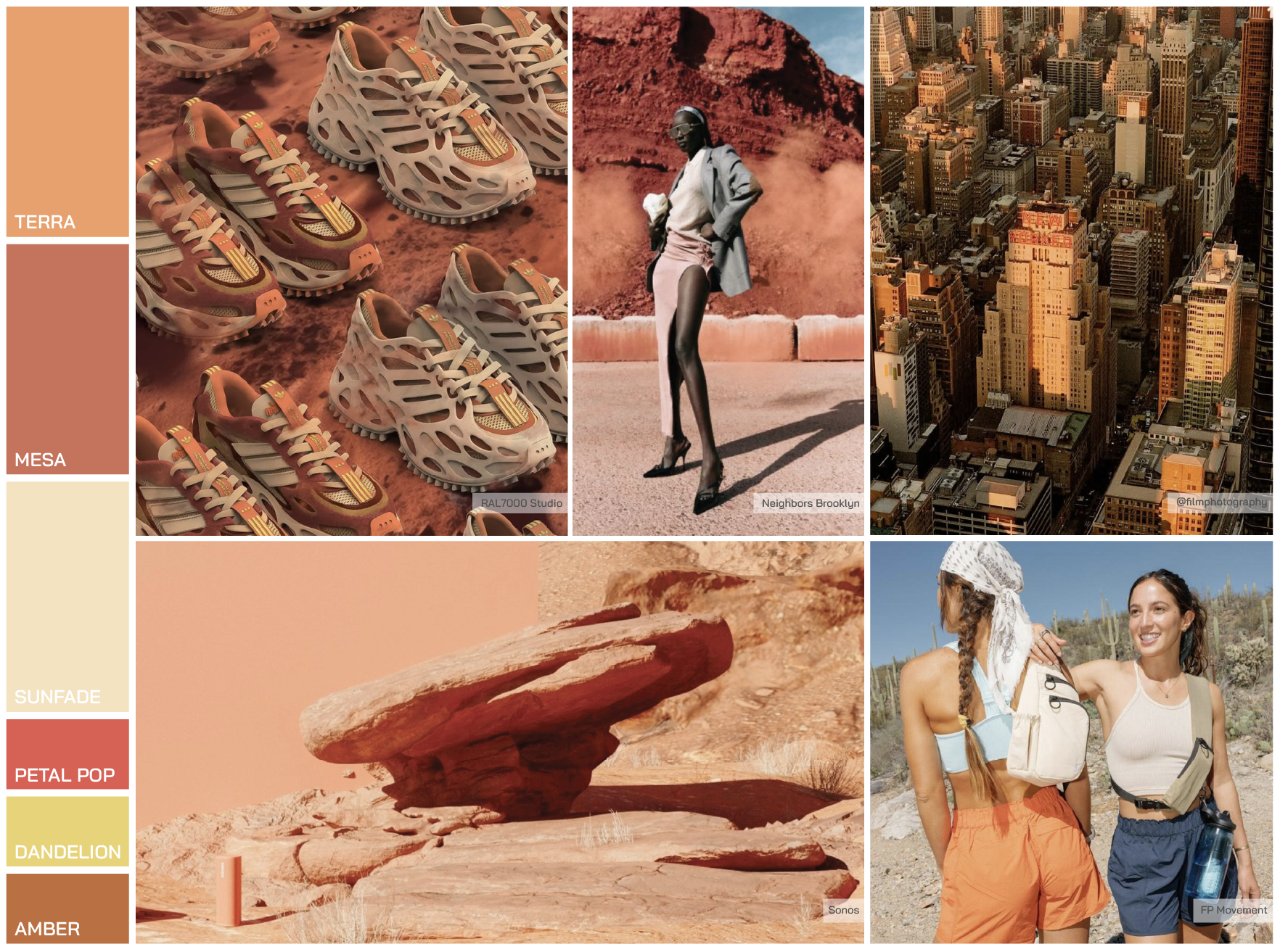
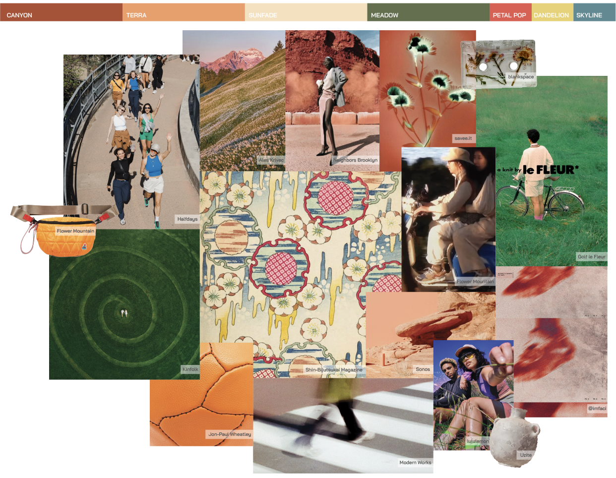
TRAIL BLOOM
Next, I created a seasonal color story, an earthy palette for Women’s Lifestyle, grounding the consumer and reflecting a young outdoor brand shaped by the traditional culture of craft.
The layered images channel a range of details, serving as the base for earthy hues and retro pops. The primary colors highlight elemental origins as consumers are seeking a grounded reconnection with nature. These meditative neutrals ground the palette with tactility, warmth, optimism. The secondary colors offer uplifting accents, advocating for fun as an everyday essential, bringing emotionally charged amusement and nostalgia. I wanted to uplevel minimalism to evolve the brand with retro nods and playful detailing. By refreshing classics and weaving together past, present, and future, this joyful palette evolves the brand’s visual language of interconnectedness while staying true to its outdoor roots.
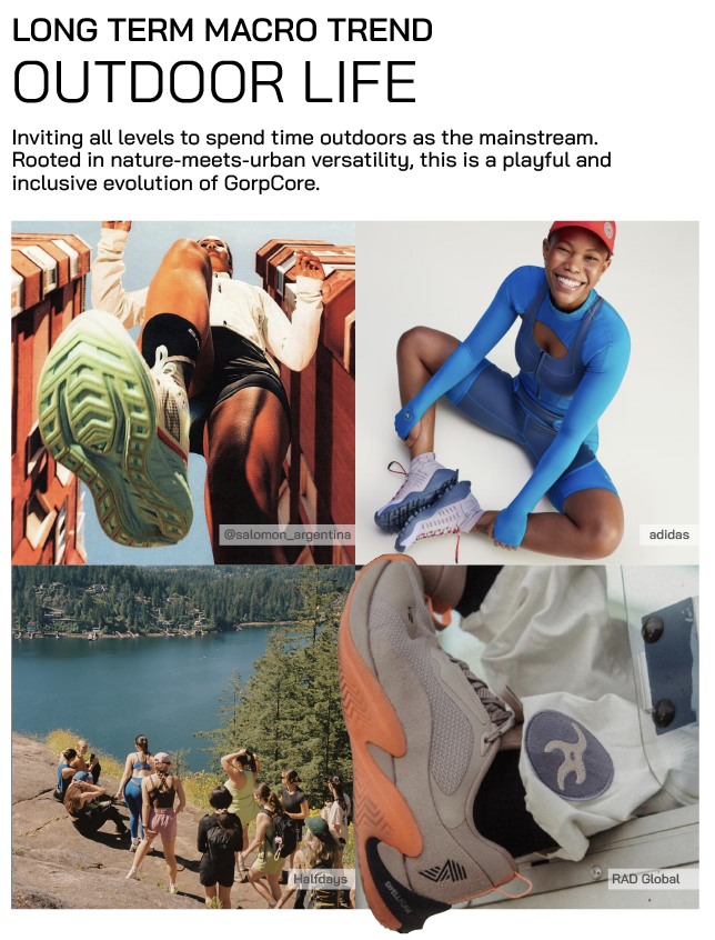
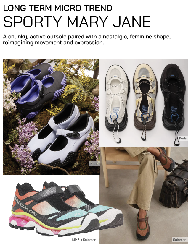
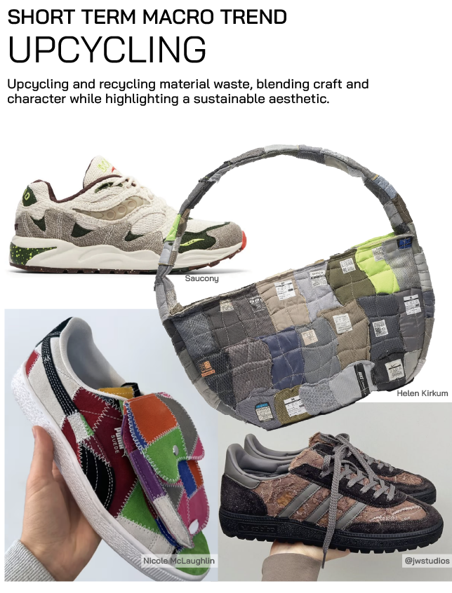
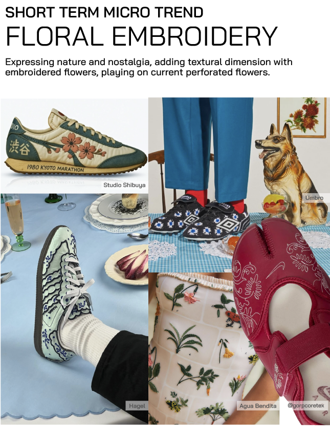
TREND FORECAST
I researched long term and short term macro and micro trends for Flower Mountain to explore in their Women’s Lifestyle line. The culmination of this color, material, and trend research led me to create the Grounded Play palette and colorway for the Tiger Hill shoe.